
I’ve written before about why the Z Fold 8 works, ergonomically, in a way that phones haven’t for a long time. And that’s really the overarching theme of everything else that follows. Shape beats specs. On paper, the Z Fold 8 Ultra is “better” in a number of ways, but none of that matters, because it’s the wrong shape. How you use the device is everything.
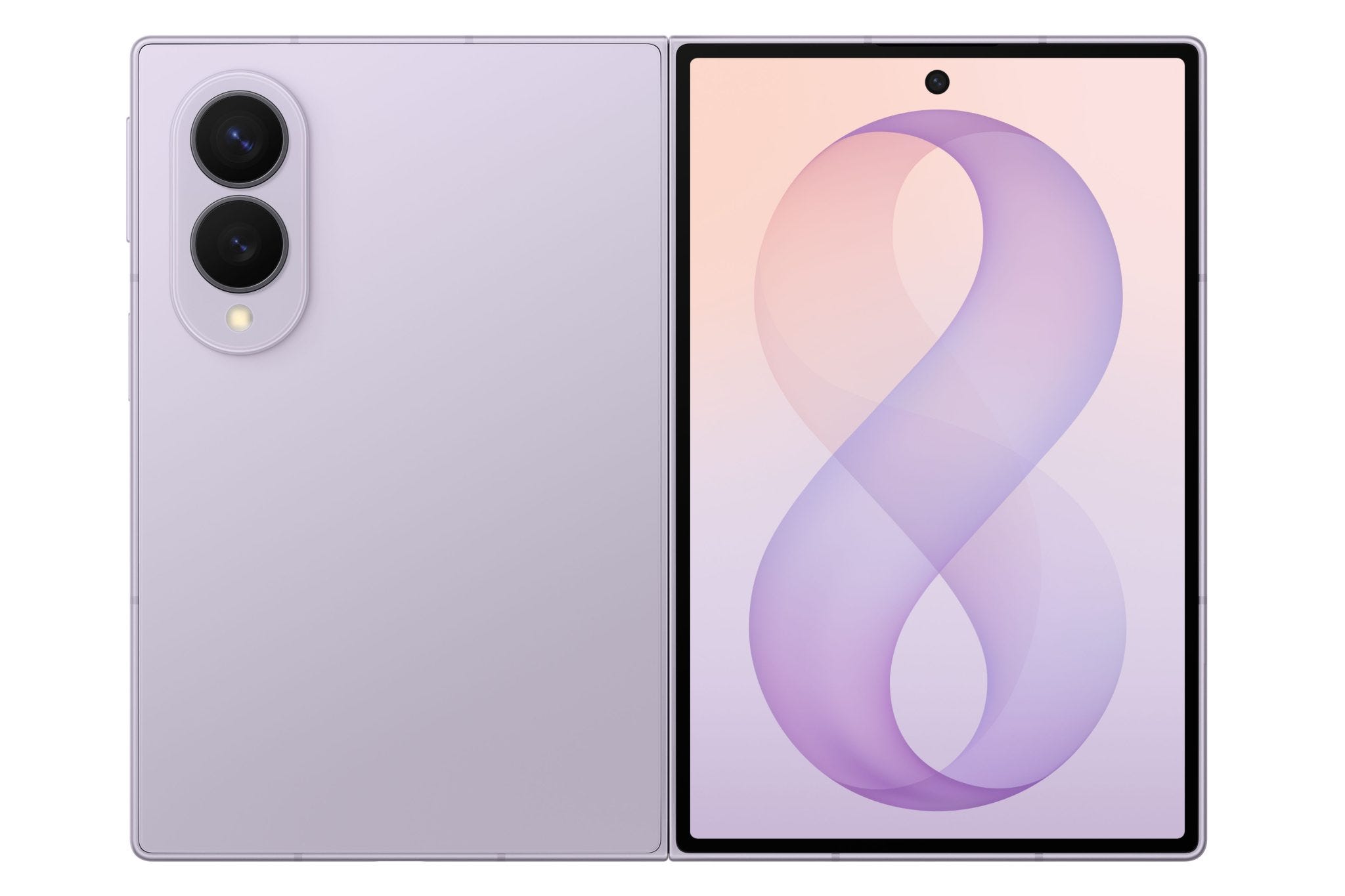
It’s three screens in, well, two
There are three distinct primary use cases for the Z Fold 8, and there’s not a lot of overlap between them. First there’s the cover screen, where the phone is a phone. Then you open it and you have a wide, landscape tablet, perfect for video and multitasking. Finally, you flip the open screen 90 degrees and you have a portrait tablet, ideal for reading books, webpages and social media. Let’s look at each in more detail.
You can judge a phone by its cover (screen)
I’ve seen a lot of people hem and haw about the cover screen being so short, so small. It’s worth noting, ahem, that the Z Fold 8 cover screen is a 5.5 inch, 10:16 aspect ratio screen. You know what else was a 5.x inch, 10:16 aspect ratio screen? The original Galaxy Note, the OG phablet. Closed, the Z Fold 8 is larger than the 5.3 inch Galaxy Note, just without the big forehead and chin bezels. So this isn’t a “new” aspect ratio for Android, at all. Rather it’s a return to an old, classic screen size that Android apps have handled just fine, thanks.
And that all bears out in actual use. The Z Fold 8 works great closed as a regular Android phone. The extra width lets apps spread out a little, with longer text line lengths for better readability. Every app I’ve tried works just fine, though I have read about badly-coded apps that cut off content or controls rather than reflowing them the way Android has suggested they do for years, with increasing urgency. Frankly, if an app doesn’t work on the Z Fold 8, it’s the app developer’s fault, not the phone’s, and the developer needs to get off their ass and fix it. Hard-coded app layouts are so last decade.
What surprises a lot of people is how usable and comfortable the cover screen actually is. I’ve seen a number of folks remark at how for a foldable, they don’t unfold it as much as they expected because they can get real work done just on the cover screen. It’s great for messaging, checking schedules, quick lookups, the usual stuff people do with smartphones. The only caveat is that you might want to adjust your keyboard settings, because by default both the Samsung Keyboard and Gboard take up half the screen or more. You can get around that by hiding the number row, or resizing the keyboard generally.
Let’s talk about typing on the cover screen. The wider body on the phone makes two-thumb typing much more pleasant and accurate. It feels like typing on a Blackberry in a lot of ways. But the width also means that single thumb typing can be a stretch (see what I did there?). Fortunately, Gboard has an easy fix for this. You can set up one-handed mode—for the keyboard, not the whole phone—and even put the icon for it on the Gboard toolbar. So when you’re trying to type with just one thumb, you can bring the other end of the keyboard much closer to you. I’ve seen a lot of people complain about this like there isn’t a simple software setting that fixes it. Come to think of it, most of the complaints fall into that category.
Wide open spaces
When you do open the phone, it turns into a completely different device. Now you have a 7.6 inch, 4:3 aspect ratio landscape tablet, almost the exact size of the original home button iPad Minis. But unlike the iPad Mini, this can actually multitask.
Okay, I know the iPad Mini can multitask, but compared to the Z Fold 8, it’s not very good at it. The OneUI 9 really shines here, with plenty of space on the inner screen for two or even three apps side by side, a trick pioneered by the trifold and reproduced here just a bit smaller, as well as adding as many completely resizable pop up windows as you want.
But even if you’re using just one app, the wide format has advantages. In something like Gmail, you have a readable list of your emails—not just the first few words of the subject—on the left and a comfortable reading pane on the right. In Kindle, you can have two pages side by side, just like a paper book.
Then there’s video. This is where the wide inner screen really comes into its own. 16:9 HDTV video, like those sweet new episodes of Ted Lasso, displays with fairly modest letterboxing, nothing like “video on the middle third of the screen” that you’d get on most foldables. And SDTV, like Seinfeld, quietly takes up the whole screen, every pixel, like it belongs there (and at handheld distance, the 7.6” screen is almost certainly a bigger effective picture, taking up more of your field of view, than whatever tube TV you watched Seinfeld on in the 90s). Video on this feels natural, personal, almost intimate. Your own personal window to countless other worlds.
A reader for all seasons
Rotate the open device 90 degrees, and it changes yet again. Now you have a 3:4 portrait screen that functions either as a giant phone or better yet, an ereader. Kindle ebooks look just as readable as they do on a dedicated Kindle, but the colors are much more vibrant and the text sharper. Websites provide clean columns of text, easy to scroll. Text-based social media like Threads and I-Still-Call-It-Twitter have plenty of space to scroll images and text. Longer form media like Substack was almost designed for this interface. And if Instagram and TikTok are more your thing than the written word, not only is each post bigger than it would be on a slab phone, but the extra width means that that vertical columns of icons to interact with the content are off to the side, not overlaying what you’re trying to look at.
There is one annoyance with this mode, though: the camera cutout. The little black spot sits either on the upper left or lower right, depending on how you hold the device, and it does get in the way of some content. I tend to hold the device with the spot on the left if there’s a column of controls there, like Substack, or bottom right if I’m reading pure text, so the ragged right margins of most paragraphs let the spot sit outside of the words themselves, the empty spaces. But it would be better for everyone, I think, if Samsung either moved it to the corner of the screen like so many of their competitors, went back to having it obscured by the display, or both. Because people can take selfies on a foldable using the good back cameras and the front cover screen, the only thing the inner screen camera is really needed for is video conferencing, and I think we can sacrifice image quality down to 3-4 megapixel for that if we can hide the camera behind the display.
You know how I said there were three configurations? I lied.
There’s one more way to use this device, and it opens up everything else. Like most high-end Samsung phones, this fully supports Samsung Dex. So if you plug it into a monitor and pair a Bluetooth mouse and keyboard (or just use a lapdock), you can turn it into a very capable desktop/laptop computer. Dex really is best in class for Android-based desktop environments, which is why the new GoogleBooks running Android 17 use an interface made with help from Samsung and a generous amount of Dex code. You get a taskbar, fully resizable windows, a “Start Menu”-like app drawer, etc. It really does feel like using any other desktop operating system, and more Android apps are reaching feature parity with their desktop counterparts (other than, oddly, the Google productivity apps like Docs and Sheets, but you can always run those in a Chrome window if you don’t like the nerfed Android versions).
Performance and battery life
The Z Fold 8 uses the 3nm Qualcomm Snapdragon 8 Elite Gen 5 for Galaxy processor, and it’s as fast as anything else on the market. So fast, in fact, that I routinely leave it in “Light” performance mode in settings to extend battery life because I literally can’t tell the difference. It plays games at full speed, though it does heat up, especially outdoors, because the 4.5mm thickness doesn’t allow for much cooling apparatus.
Battery capacity is better than the Z Fold 7, charging is faster than the Z Fold 7, and actual battery life is within minutes of the Z Fold 8 Ultra because that device has a larger battery and a larger screen to drain it. It’s not as high capacity or fast charging as Chinese imports, but the battery in this will actually last 5-7 years, while the more aggressive silicon-carbon batteries will be lucky to still be around 3 years from now. Everything in life is a trade-off, and Samsung has chosen longevity over speed.
But I heard it (insert complaint here)
It’s not all good, though, at least if you listen to people on the internet. So let’s address some of the elephants in the room.
The speakers aren’t stereo
Yes, both speakers are on the left half of the device. Samsung could fix this if they moved the inner screen camera to the corner, freeing up the top right center for a speaker, but for now, the speakers are on opposite horizontal sides of the device only with the cover screen in landscape or the inner screen in portrait. The inner screen in landscape, where serious video watching is going to happen, sounds like slightly off-center mono audio.
And seriously, if you care at all about stereo sound, use some damned headphones. Even if the speakers were on the sides of the device, we’re talking about a maximum separation of 6 ⅜ inches. At the distance you’re going to hold the device from your head, this is not even close to reasonable stereo separation. People bitching about this are really digging for something to complain about.
They removed Flex Mode
Yes, even the software settings for Flex Mode have been removed on the Z Fold 8. For those not in the know, Flex Mode is something Samsung foldables have been able to do where the device is partially folded and resting on the table or desk like a tiny laptop. The video or other content is on the top half, and the bottom, horizontal half shows video controls, or for apps that don’t explicitly support the feature, a trackpad and scroll jogger.
The problem with Flex Mode on the Z Fold 8 is that Flex Mode is most useful with the device open between 90 and 150 degrees, like a laptop. But because of the new Titanium Flex hinge on the Z Fold 8, once the device opens past 90 degrees, it snaps on its own to the full 180. The tension in the titanium plate forces the issue. This means it opens with a satisfying snap, but it can’t stay open to the arbitrary angles Flex Mode requires.
Fortunately, by far the biggest use for Flex Mode was watching video with your hands free to do other things—not judging, you do you—and there’s another way to solve that problem with the Z Fold 8. Instead of opening it like a laptop, start the video on the cover screen, lay the phone down, then partially open it to a 45-60 degree angle. The bottom half provides a stand, and the 16:10 cover screen is perfect for modern TV or YouTube videos. You do have to touch the actual video to control playback rather than having dedicated controls on the bottom surface, but I’ve been perfectly happy with this alternative, and I used Flex Mode daily on my Z Fold 7.
There’s no telephoto lens
This is one of those things that seems damning until you actually compare it to what you had before. Yes, the Z Fold 8 drops the telephoto lens that the Z Fold 7 and Z Fold 8 Ultra share. But no, it’s no great loss, and I’ll tell you why.
That telephoto lens on the other Z Folds is a 10MP 3X zoom. Just 3X. And a relatively small 10MP sensor at that, so it’s not great in low light. I’ve seen several people show side by side images taken with the Z Fold 8 Ultra’s telephoto camera and the Z Fold 8’s 50MP main sensor cropped down to the same image, what we call “digital zoom.” And the difference is damn near imperceptible. The optical zoom on the Ultra is just taking up space. You don’t need it. Up to about 5X. You do see significant differences at higher zoom rates, where the Z Fold 8 has to use generative AI to “enhance” the image. But here’s the thing. If you’re shooting 10X images, might I suggest that a cell phone isn’t the right tool for the job, no matter who makes it. Just buy a DSLR with real lenses and call it a day.
.png)
It’s so pricy!
Yes, this phone starts at $1,900. With the economy being what it is—so not going to discuss why—that’s a lot of money. But there’s a difference between cost and value. Yes, the phone costs a lot of money, but no one but you can decide if you’re going to get $1,900 of value out of it. Personally, for everything this can do, I think it’s a steal. Your mileage may vary. But make the decision yourself. Don’t let a YouTuber dictate what is and isn’t worth it for your life.
So what can they fix?
Let’s look at actual flaws that Samsung can improve on next year. Nothing is so perfect that it can’t be improved, after all (waves at John Siracusa).
First, I’d rotate the camera island 90 degrees. I realize a vertical camera island is part of the Galaxy design language, but come on, Samsung, that ship has sailed. The industry has spoken, and a horizontal camera island is just better at preventing the frankly ridiculous amount of wobble these things have sitting on a flat surface. Get with the program.
As mentioned before, I’d move the inner screen camera to the corner, rather than having it centered on one half of the phone. And if possible, return to the under-display camera, since we’re only using this damn thing for video conferencing anyway. No one needs a 10MP image in Zoom.
The inner screen has a nice anti-reflective coating that greatly reduces glare. This not only makes it better for watching video, but it also makes the significantly-improved crease even less visible. But the cover screen, which you’re going to see a lot more in direct sunlight, doesn’t have this treatment. Let’s get anti-glare on the cover screen, too.
Samsung, it’s time to stop being Qi-curious. If Google can do it, you can do it. Put the damn ring of magnets inside the device so we can use MagSafe/Qi2 accessories without chunking up this beautiful industrial design with a case.
And lastly, I think we’d all gleefully accept making the device 0.6mm thicker, 1.2mm thicker when closed, if it meant getting the S-Pen back. I know Samsung is working on an active stylus that doesn’t require a digitizer layer, but until that’s ready, give us back the old passive S-Pen. This inner screen, with the shallow, minimal crease, is begging to be used as a sketchpad, and we can’t do that. Won’t someone think of the artists?
The big picture
This is not the phone for you if you need to have all the biggest numbers on the spec sheets to feel like you have a “premium” device. This phone is something else, something special.
Back in the late 90s, Microsoft flew a bunch of us Palm influencers out to Redmond to show us the Pocket PC. I remember walking somewhere with Hal from PalmStation and we were brainstorming what our ideal mobile computer would be. We imagined something the size of the PDAs of the day, comfortable in the hand and the pocket. But unlike the devices of the late 90s, it would be all screen, with only minimal bezels. It could unfold or unroll into a tablet. It could dock with a full size monitor, mouse and keyboard to become a desktop. You could run your whole life from this device, which magically changed shape to be whatever you needed. I never forgot that moment, and I’ve been watching ever since for the device we wanted.
Now I have it in my hand.